
Improved Editor Icons
complete
Denis Omerovic
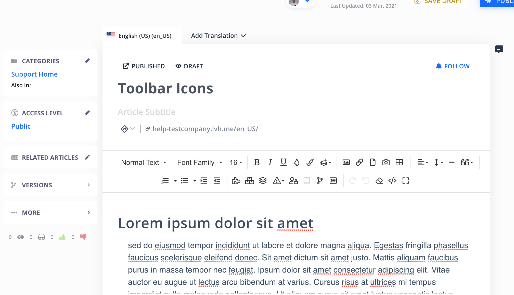
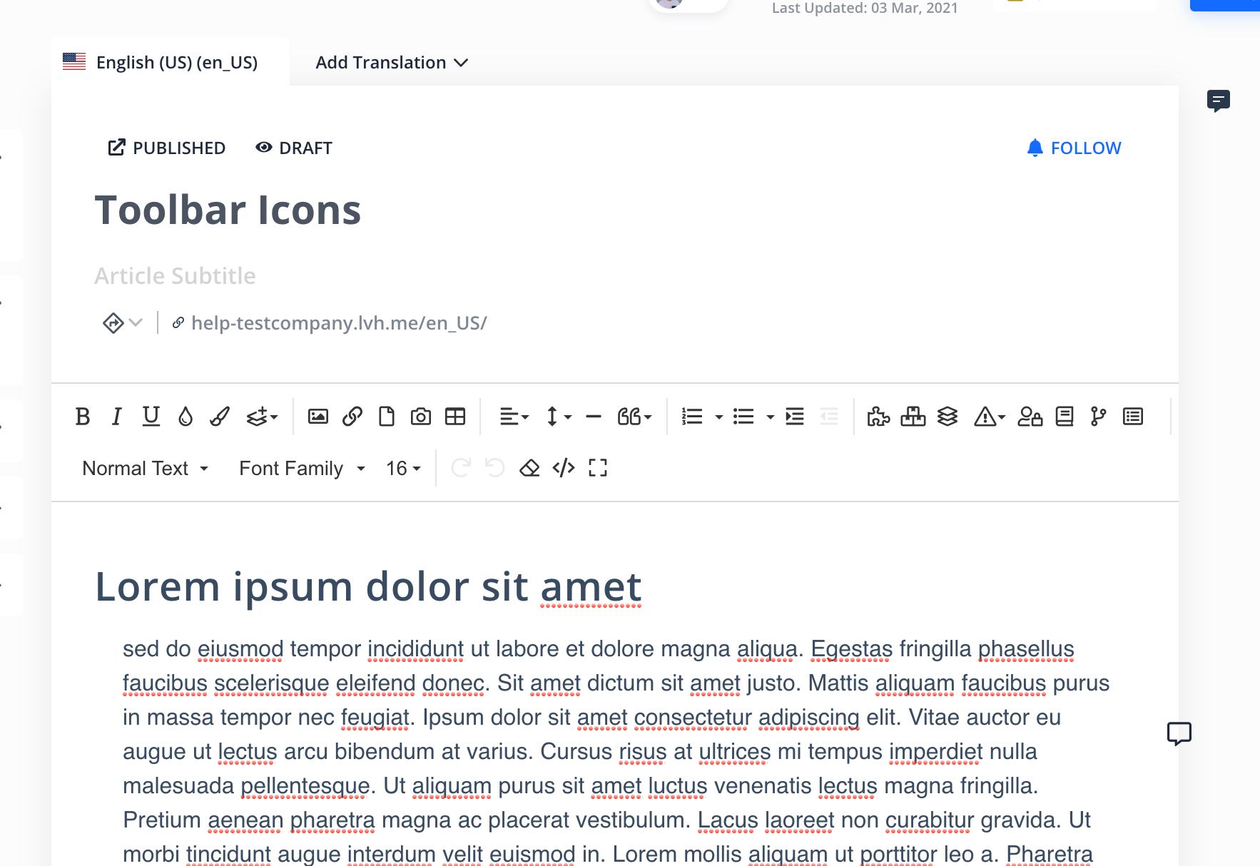
Mamta Buch Rochelle Osgar Josh Bartolomucci Vincent Connelly Hannah Judkins We are considering moving text format, font and font size to the top of toolbar as it's more related to formatting. So we have two new screenshots. Do you folks thinks that one of those screenshot options looks better than the one we currently have?
Vincent Connelly
Denis Omerovic: I personally would prefer it to be
Font, Bold, left justified, Bullets
new line
Image, Article, Undoand put the remove formatting button in the Bold section.
Mamta Buch
Denis Omerovic: I agree the text format, font, and size should move to the top. I prefer the top screenshot where all the buttons are together but either would be fine with me.
Josh Bartolomucci
Denis Omerovic: Font related options should stay together imo. Again, please use Gmail as a pretty solid example. The first screenshot is better imo. Thanks!
Vincent Connelly
Denis Omerovic: If I can make one more comment, can you add an @ symbol and that pulls up a list of articles with URLS. I stumbled upon that today and would have never known if I didn't write an article that used the @ symbol. I did submit a feature request for this. https://helpjuice.canny.io/feature-requests/p/insert-article-url-only
Rochelle Osgar
Denis Omerovic: I prefer the top image.
Denis Omerovic
complete
Hi folks,
This is now complete and it's live on your accounts.
Mamta Buch
Denis Omerovic: Thank you all for the speedy turnaround! There is a similar issue with choosing the alignment within table settings. I will open a separate request for that
Denis Omerovic
Mamta Buch: No need to opening a request. I'll fix it :)
Mamta Buch
Denis Omerovic: You are awesome!
Mamta Buch
Denis Omerovic This looks GREAT! I really like the expanded options that are shown on mouse click. My preference would be the second screenshot where font style, name, and size are on the second line!
Denis Omerovic
Mamta Buch: thank you for your feedback. Yeah, I definitely think second screenshot is maybe the best solution for everyone. I really appreciate your feedbacks.
Rochelle Osgar
Is it a possibility that we could arrange the editor icons in our own order? From the video you shared most of the options I use are not in the "more" option which would be very time consuming.
Denis Omerovic
Rochelle Osgar: Unfortunately that is not possible. The video I shared is just one of the options. I think screenshots I shared will suit to everybody. All icons are visible, no extra clicking. Do you think this could work for you?
Rochelle Osgar
Denis Omerovic: I do like the layout of the screenshots. Both are good options! Thank you for working on this!
Denis Omerovic
Rochelle Osgar: I really appreciate your feedbacks. The new toolbar should be live by Monday so I'll keep this post open for a few days until we definitely decide which version is going live.
Denis Omerovic
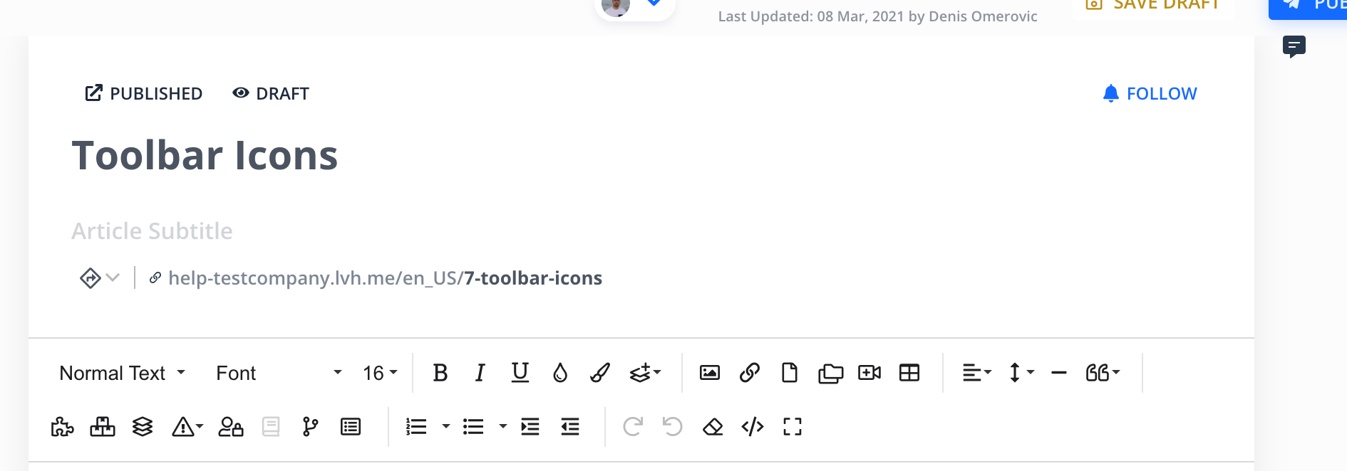
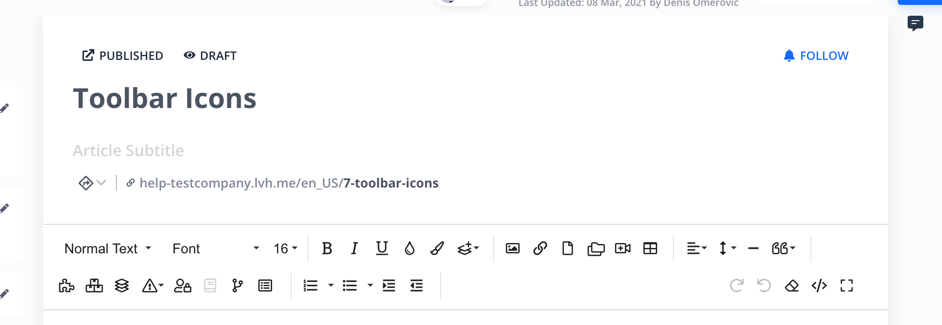
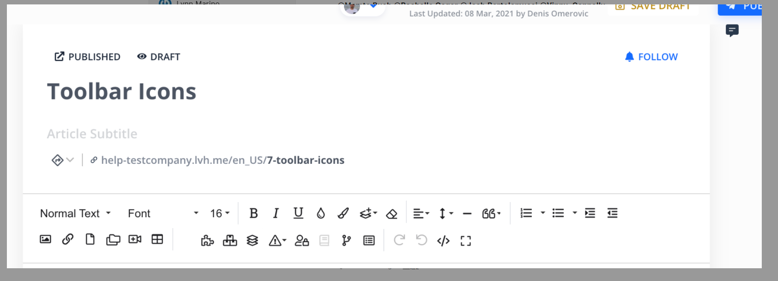
Hi Josh Bartolomucci Mamta Buch Hannah Judkins,
We are working on improving editor toolbar and we have a few solutions. I'll share some screenshots and videos with you so feel free to leave any feedbacks. We really appreciate your feedbacks.
Lynn Marino
Denis Omerovic: I would like the code icon to remain visible if possible. Not a deal breaker, but I use it often
Josh Bartolomucci
Denis Omerovic: This is definitely looking much better! Thank you! I highly recommend duplicating what you can from Gmail. Not to say their WYSIWYG editor is perfect, but there are more pros than cons.
Denis Omerovic
Lynn Marino: We will leave all icons visible as you can see on screenshots above. The third version is shown in the video above, that version doesn't have code icon and many others visible until you open dropdown.
Joel Andrews
Denis Omerovic: we use the text color and background color buttons a lot, so this change would add a lot of clicks for us. Any way to allow customization of the toolbar for individual authors?
Denis Omerovic
Joel Andrews: Unfortunately arranging/adding icons per author is not possible. I shared some of the possibilities but I think this solution suits to everybody. All icons are there, no need for extra clicking

Joel Andrews
Denis Omerovic: sorry, I missed your latest image. Looks great!
Vincent Connelly
Denis Omerovic: Can the "video" icon not be a camera and maybe a film strip or something more video related. That one always gets me when I need to embed a YouTube video.
Vincent Connelly
Denis Omerovic: I like the option to have all of the icons always available instead of clicking the more button. Saves time. I would be happy with two rows of icons.
Vincent Connelly
Denis Omerovic thank you for the icon update!
Denis Omerovic
in progress

Emil Hajric
planned
Josh Bartolomucci
Emil Hajric: Thank you!
Denis Omerovic
open
Mamta Buch
I wholeheartedly agree! Unfortunately my eyesight is not getting better with age!!
Hannah Judkins
Icons need to be a little larger and perhaps a bit more intuitive.
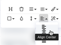
Also, the "tooltip/on hover" text is covered over by my mouse, so sometimes I have to guess what the label says. Please make this more responsive so that the mouse doesn't cover button pop-up text. This image is an approximation of how the editor cursor blocks the tooltip text.

Load More
→